Analyzing Time Series Structure
In time series analysis, "structure" refers to the underlying, predictable patterns within the data. We begin by using decomposition to reveal this structure, separating a series into its large-scale components like trend and seasonality. The presence of these components determines a critical property—whether the structure is stationary (stable over time). If it is not, we use techniques like differencing to alter the structure by removing the trend. Finally, once the major patterns are handled, we use ACF/PACF plots to diagnose the remaining, finer-grained correlation structure, which is essential for building an accurate forecasting model.
Why This Analysis Matters: From Visuals to Quantifiables
In any predictive analysis, the goal is to model features that account for the variance in a target variable. In time series analysis, this means understanding where the variance is coming from.
A significant portion may come from the long-term trend 📈, which can be influenced by major factors like new government regulations or shifting market dynamics. For tactical and operational planning, another part of the variance is explained by seasonality 📅—the predictable patterns that repeat at regular intervals, such as holiday sales spikes.
What remains are the residuals ❓. These help us understand events idiosyncratic to a specific time, like a one-off market shock or a targeted sales campaign. Isolating each of these components is the key to building a comprehensive and reliable forecasting model.
Time Series Decomposition
Decomposition is the process of breaking down a time series into its fundamental structural components. This allows us to isolate and analyze each part individually. A time series (\(Y_t\)) is typically viewed as a combination of three components:
- Trend (\(T_t\)): The long-term direction of the series.
- Seasonality (\(S_t\)): The cyclical patterns tied to the calendar.
- Residual (\(R_t\)): The irregular, random noise left over after accounting for the trend and seasonality.
There are two primary models for combining these components:
-
Additive Model: \(Y_t = T_t + S_t + R_t\)
- Use this when the magnitude of the seasonal fluctuation is constant and does not depend on the level of the trend.
-
Multiplicative Model: \(Y_t = T_t \times S_t \times R_t\)
- Use this when the seasonal fluctuation scales with the trend. For example, if holiday sales are consistently 20% higher than the baseline, the absolute size of that fluctuation will grow as the baseline sales trend upwards. This is common in economic data.
It’s natural to first think of combining components additively (\(Y = T + S + R\)), and for many series, this is correct. You should use an additive model when the seasonal variation is roughly constant in absolute terms, regardless of the trend. For example, a local bakery might sell about 200 more loaves every Saturday than on a weekday. This 200-loaf difference remains stable whether their overall weekly sales are trending up or down.
However, you should use a multiplicative model (\(Y = T \times S \times R\)) when the size of the seasonal swing is proportional to the level of the trend. Think of a national retailer whose fourth-quarter sales are consistently 30% higher than other quarters. When the company's annual revenue is $10 million, that 30% jump is $3 million. When the company grows and its revenue is $100 million, that same 30% seasonality now represents a $30 million jump. The seasonal effect grows as the trend grows. This is very common in economic and sales data.
Code Demo: Decomposition with statsmodels
The statsmodels library provides a simple function to perform this decomposition. We'll use the classic "Air Passengers" dataset, which exhibits a clear trend and multiplicative seasonality.
# Data prep
df = pd.read_csv("/content/drive/MyDrive/dataprogpy/data/AirPassengers.csv", parse_dates=[0])
df.columns = ["month", "passengers"]
df.set_index("month", inplace=True)

# Decomposition
decomposition = sm.tsa.seasonal_decompose(df['passengers'], model='multiplicative', period=12)

# Visualization
fig = decomposition.plot()
fig.set_size_inches(10, 8)
plt.show()
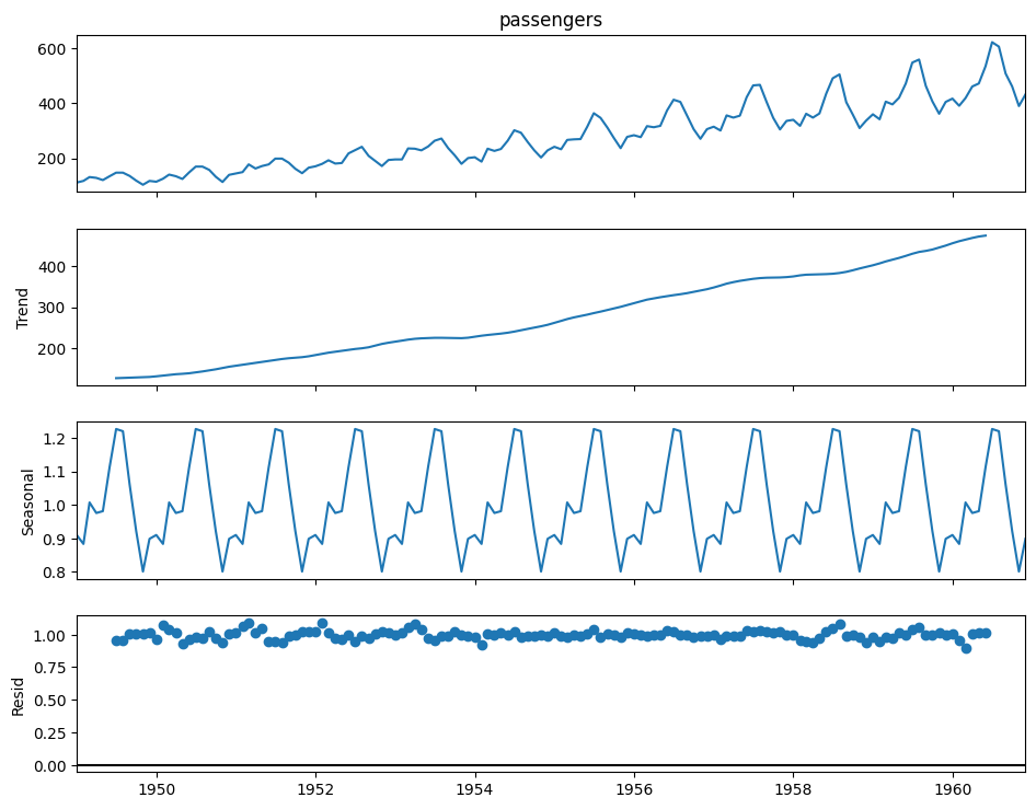
The output plot displays the original observed series and its three extracted components. Analyzing these individual plots is far more insightful than looking at the original series alone.
Autocorrelation (ACF and PACF)
While decomposition reveals the primary trend and seasonal patterns, we also need to understand how each observation relates to its immediate past values. This is measured by autocorrelation.
-
Autocorrelation Function (ACF): This function measures the correlation of a time series with a lagged version of itself. For example, the ACF at lag-12 measures the correlation between a month's value and its value from the same month one year prior. High ACF values at seasonal lags confirm the presence of seasonality.
-
Partial Autocorrelation Function (PACF): This measures the correlation between a time series and a lagged value after removing the effects of all shorter lags. For example, the PACF at lag-3 measures the "direct" effect of the observation three periods ago, after accounting for the influence of the observations at lag-1 and lag-2.
These two functions are the primary diagnostic tools for determining the parameters of ARIMA models once a series has been made stationary.
ACF/PACF vs. Standard Correlation
- Correlation Coefficient vs. Function: A Pearson correlation coefficient is a single number that measures the linear relationship between two different variables (e.g., advertising spend and sales).
- An Autocorrelation Function (ACF) applies the same math, but it calculates the correlation between a series and itself at various past points (lags). It’s a "function" because it gives you a whole set of correlation coefficients—one for each lag you examine.
Do I Need Both ACF and PACF?
You cannot just pick one because they tell you different things.
- ACF shows the "full" correlation between a point and a lag. This includes both the direct relationship and indirect relationships that work through the shorter lags in between.
- PACF shows only the "direct" correlation between a point and a lag, after mathematically removing the influence of the shorter, intervening lags.
Analogy: Imagine three people in a line whispering a secret: A -> B -> C. The ACF between A and C would be high because A's message gets to C through B. But the PACF between A and C would be zero, because there is no direct link from A to C; it's entirely mediated by B. The ACF and PACF plots give us these two different views, and the unique patterns they create are what allow us to diagnose the underlying structure of the series for modeling.
How do I choose a lag value
Remember, the big idea of a lag is to look at a past version of the data to see if it relates to the present. When students ask, "How do I choose the lag value?" the answer is that during the initial analysis, you don't choose a single lag. Instead, you use tools like the ACF and PACF plots to examine a whole range of lags at once.
The goal is to spot patterns in these plots. For example, in monthly sales data, you might see a significant spike at lag 12, lag 24, and lag 36. This pattern tells you that there is a yearly seasonal relationship in your data. The choice of specific lag values comes later, during the modeling stage, and it's directly guided by the significant lags you identify in these plots.
Achieving Stationarity with Differencing
As discussed in Module 1, many models require a series to be stationary. The most common method to remove a trend and achieve stationarity is differencing. This is the process of computing the difference between consecutive observations.
Relationship Between Decomposition and diff()
These concepts are related but serve different purposes. They aren't interchangeable.
-
Decomposition (Additive/Multiplicative) is an analytical framework. Its purpose is to help you understand and see the different structural components of a series (Trend, Seasonality, Residual). It’s a diagnostic tool.
-
Differencing (
diff()) is a transformation technique. Its purpose is to modify the series to achieve stationarity, most commonly by removing the trend component that you identified during your analysis.
Think of it this way: Decomposition is the diagnosis (e.g., "This series has a strong trend component, making it non-stationary"). Differencing is the treatment ("Let's apply differencing to remove that trend").
# Create a new column with the differenced passenger counts
df_diff = pl.from_pandas(df).with_columns(
    pl.col("Passengers").diff(n=1).alias("passengers_diff")
)

# Plot the differenced series
df_diff.plot(x="Month", y="passengers_diff")
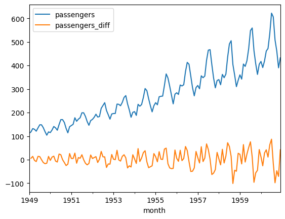
Notice how the plot of the differenced data no longer has a clear trend; its mean appears constant.
Code Demo: ACF/PACF Plots
We use statsmodels to plot the ACF and PACF, typically on the stationary (differenced) data.
from statsmodels.graphics.tsaplots import plot_acf, plot_pacf

# Drop missing values resulting from the differencing
differenced_series = df['Passengers'].diff().dropna()

# Plot the ACF and PACF
fig, (ax1, ax2) = plt.subplots(2, 1, figsize=(10, 8))

plot_acf(differenced_series, ax=ax1, lags=40)
plot_pacf(differenced_series, ax=ax2, lags=40)

plt.show()
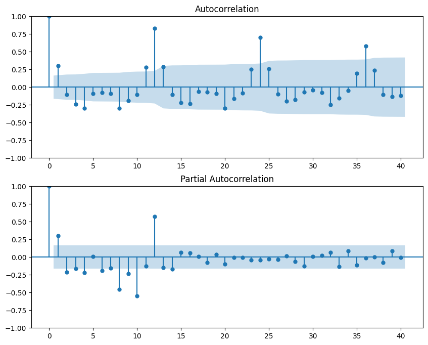
How to interpret the plots:
- The x-axis represents the number of lags.
- The y-axis represents the correlation coefficient, from -1 to 1.
- The blue shaded area is the confidence interval. Spikes that extend beyond this area are considered statistically significant. The patterns of these significant spikes help us choose our model parameters.
A Practical Workflow for Pre-Modeling Analysis
The concepts we've discussed fit together into a logical workflow that takes you from raw data to a series that is ready for forecasting. This pre-modeling analysis begins with understanding the big picture. Your first step is to decompose the time series to visually identify its primary drivers. This involves separating the data into its Trend, Seasonal, and Residual components, which also forces you to decide between an additive or multiplicative model based on the nature of the seasonality.
Once you have a high-level view, the next step is to formally assess stationarity. By examining the trend component from your decomposition, you can diagnose if your series is non-stationary, which is common for most real-world business data.
If the series is indeed non-stationary, the third step is to transform it. The goal here is to create a new, stationary version of your data. This is most often accomplished through differencing, which effectively removes the trend. After applying the transformation, you should plot the new series to confirm that it appears stationary.
The final step in this preparatory workflow is to analyze the stationary series using ACF and PACF plots. With the major trend and seasonal components handled, these plots allow you to diagnose the finer-grained correlation structure that remains. The patterns you discover here are the crucial clues that will guide you in selecting and configuring an appropriate forecasting model in the next module.